Brand Guidelines
Brand
The System Behind the Page
Every color, typeface, and rule we use to build F9 Notes — documented in one place. If you are writing about us, linking to us, or building something alongside us, take what you need from here.
01 The Mark
Logo
One mark, one lockup. The F9 glyph is the identity; the word Notes sits beside it in Newsreader, baseline-aligned, never heavier than the mark itself.
Notes
Primary Lockup
Notes
Navigation Lockup
 Notes
Notes
Reversed Lockup
The navy mark is the default. On Navy 700 and darker — or over any dark ground — switch to the reversed mark; never let the navy mark sit on navy.
Clear Space
Keep clear space equal to half the height of the mark on all four sides. Nothing crosses that boundary — not type, not rules, not another logo.
Minimum Size
24px tall is the floor. Below that the numeral closes up and the mark reads as a smudge. In print, hold to 8mm.
Do
- Pair the mark with the word "Notes" set in Newsreader, aligned to the baseline of the mark.
- Place the navy mark on Surface 950, Surface 900, or Surface 800.
- Switch to the reversed (white) mark on Navy 700 and darker, or over any dark ground.
- Reproduce the mark at 24px height or larger so the numeral stays legible.
- Use the mark at 3% opacity as an oversized background element, as on the home page.
Don't
- Recolor the mark to anything but Navy 700 or the approved reversed white, gradient-fill it, or give it a drop shadow.
- Stretch, rotate, skew, or outline the mark.
- Place either mark on a busy photograph, or the navy mark on a mid-tone ground where it loses contrast.
- Set the wordmark in any face other than Newsreader, or lock it up with unapproved text.
Download

Social Card
The Preview Image
Every link to F9 Notes unfurls into this card. It is the brand's most-seen artifact and the only one most people meet before the site itself — so it carries the full lockup, the house lede, and nothing else.
Download the card PNG · 1200×630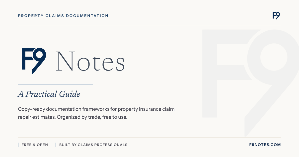
02 The Palette
Color
Navy for authority, warm neutrals for paper, four surfaces for ground. Semantic color is reserved for meaning and never used to decorate. Click any swatch to copy its hex.
Navy
PrimaryThe signature of the brand. Navy carries headlines, primary actions, rules, and every moment that needs authority. Navy 700 is the anchor — it is the logo color, the button color, and the link color.
Warm
SecondaryA paper-adjacent neutral that keeps the system from feeling clinical. Warm supplies the borders, dividers, and quiet backgrounds that hold editorial layouts together. Used sparingly as a text color.
Surface
GroundFour grounds, no more. Every page sits on Surface 950; cards and panels lift to Surface 900; footers and inset bands drop to Surface 800. The page is never pure white and never pure gray.
Semantic & Ink
Reserved- Correct
- Approved notes, the corrected half of a before/after
- Caution
- Pending review, in-progress claim phases
- Avoid
- Common mistakes, struck-through examples
- Ink
- Headlines and body copy on light grounds
- Body
- The default paragraph and label color
Approved Pairings
Eyebrow
Ink on Surface
The default. Every long-form page uses this pairing end to end.
Eyebrow
White on Navy
Primary buttons and full-bleed emphasis bands. Never for body copy at length.
Eyebrow
Navy on Tint
Category codes, tags, and quiet callouts inside a card.
03 The Voice on the Page
Typography
Two families do all the work. Newsreader carries anything that should feel considered — headlines, ledes, and figures. Instrument Sans handles everything that should feel operational — body copy, labels, and interface.
Newsreader
SerifAa
ABCDEFGHIJKLMNOPQRSTUVWXYZ
abcdefghijklmnopqrstuvwxyz
0123456789
- Weights
- 200 · 400 · 500 · 600 · 700
- Styles
- Roman · Italic
- Used for
- Headlines, ledes, figures
The italic is the house lede — use it once per section, never twice.
Instrument Sans
SansAa
ABCDEFGHIJKLMNOPQRSTUVWXYZ
abcdefghijklmnopqrstuvwxyz
0123456789
- Weights
- 400 · 500 · 600
- Styles
- Roman
- Used for
- Body, labels, interface
Nothing above 600. The system gets its weight from color and rules, not from bold type.
Both faces are open source and served from Bunny Fonts. No tracking, no license fee.
The Scale
Notes
Display
Newsreader
80px · Extralight 200 · 0.85 leading · +0.04em
What Is an F9 Note?
Section Heading
Newsreader
44px · Semibold 600 · Tight leading & tracking
Anatomy of a Good Note
Subheading
Newsreader
29.6px · Semibold 600 · Tight leading
A Practical Guide
Editorial Lede
Newsreader Italic
26.4px · Medium 500 · Italic
Copy-ready documentation frameworks for property insurance claim repair estimates.
Body
Instrument Sans
16px · Regular 400 · 1.85 leading
Written by claims professionals, organized by trade, free to use.
Small Body
Instrument Sans
15px · Regular 400 · 1.85 leading
Property Claims Documentation
Eyebrow
Instrument Sans
11px · Semibold 600 · Uppercase · +0.2em
For Property Insurance Claim Estimating
Meta Label
Instrument Sans
11px · Medium 500 · Uppercase · +0.1em
04 The Kit
Elements
The system has almost no rounded corners and no drop shadows at rest. Structure comes from hairlines, left accent bars, and generous space. Motion is short, eased, and never decorative.
Actions
Square corners, uppercase label, 28px horizontal padding. The arrow shifts 2px on hover — that is the whole animation.
Labels & Codes
Small caps, wide tracking, a 2px navy bar on the left edge. Category codes are tinted; tags are quieter; counters are borderless except for the rule.
Note Panel
Detach & Reset Toilet
Removed to allow full removal of the wet subfloor beneath the fixture, then reset with a new wax ring.
One hairline border, one 2px accent bar. On hover the border warms to Navy 300, the bar goes solid navy and grows to 3px.
Rules & Motion
1px · warm-200 — section divider
1px · navy-300/70 — hero rule
2px · navy-600 — accent bar
- Easing
- cubic-bezier(.16, 1, .3, 1)
- Entrance
- 400ms · 12px rise
- Stagger
- 60ms per step
- Hover
- 150–200ms · ease
05 How We Write
Voice
The same discipline we ask of a good F9 note applies to our own copy: say what it is, say why it matters, and stop.
01 Plain over clever
The audience is working a claim, not reading marketing. Say the thing directly and stop.
Yes
Free, copy-ready documentation notes for property estimates.
No
Revolutionize your claims workflow with next-generation documentation.
02 Neutral on the claim
F9 Notes serves adjusters, contractors, and estimators alike. Copy never argues one side of a claim.
Yes
Document what was done, why it was needed, and what conditions drove it.
No
Get the payout you deserve from the carrier.
03 Built by practitioners
Credibility comes from the field, not from adjectives. Reference the trade, the tool, the situation.
Yes
Written by claims professionals, organized by trade.
No
Industry-leading, best-in-class claims content.
04 Careful with trademarks
Third-party product names are always descriptive references, always attributed, never implied endorsements.
Yes
Copy-ready for Xactimate®.
No
The official Xactimate® notes library.
Naming
- F9 Notes
- The product. Capital F, numeral 9, capital N. Never "F-9", "f9notes", or "The F9 Notes".
- An F9 note
- The thing itself, lowercase "note", when referring to a single piece of line-item documentation.
- Third-party marks
- Always carry the symbol on first use — Xactimate®, Cotality®, Simsol™ — and attribute in the footer.
06 Permission
Usage
You may use the F9 Notes name and mark to link to us, to credit us as a source, or to say that your work references our directory. No permission request needed for that — take the files above and follow the rules on this page.
You may not use the name or mark in a way that suggests we built, endorsed, or partnered on your product, nor as part of your own logo, product name, or domain. Anything beyond plain attribution is a conversation — get in touch first.
The colors and type scale documented here are not proprietary. If they are useful to you, use them.
In Company
F9 Notes is a collaboration. When the marks appear together, they sit on one baseline, at equal optical weight, on a light ground.



Better information, better education, and better tools.
Browse the Directory